UI/UX Design
Prototyping
Mobile App
Coming Soon
Visit Project Site
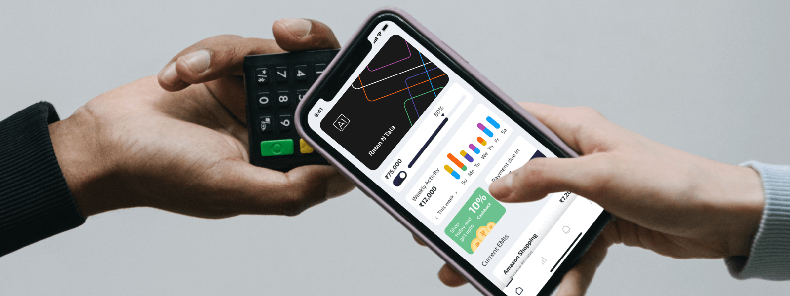
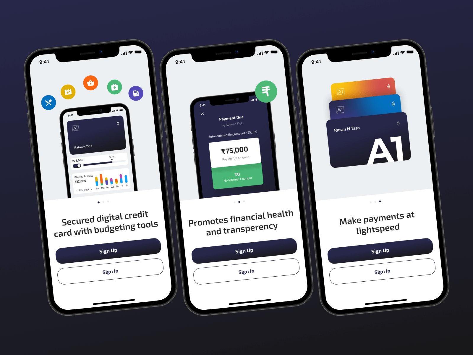
Since online shopping has increased the number of online transactions, credit card fraud has also increased. Our first challenge was to digitize the credit card and make it more secure for the audience. The second challenge was to encourage people to make healthy financial decisions by paying less interest and paying their bills on time. The credit card was to be used anytime and anywhere for online and offline transactions which had to be secure. Our third challenge was to ensure that users could track their expenses.
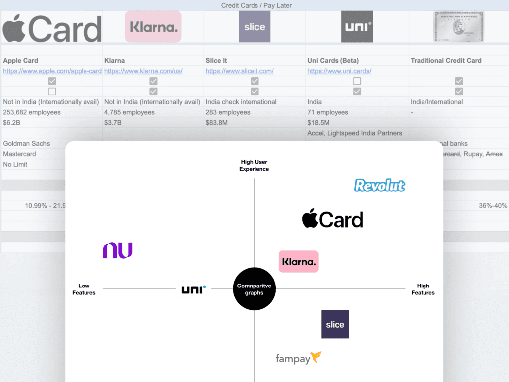
The goal was to provide an awesome customer experience to credit card users. We began by doing competitor research to understand their strengths, weaknesses, strategies which helped us to analyse a market gap that we could fill. Our discussion with the client enlightened his vision of extraordinary customer service and satisfaction. To provide great satisfaction we wanted to understand what users needed, so we interviewed a few users from our competitor to understand their needs, goals, problems and expectation in detail.
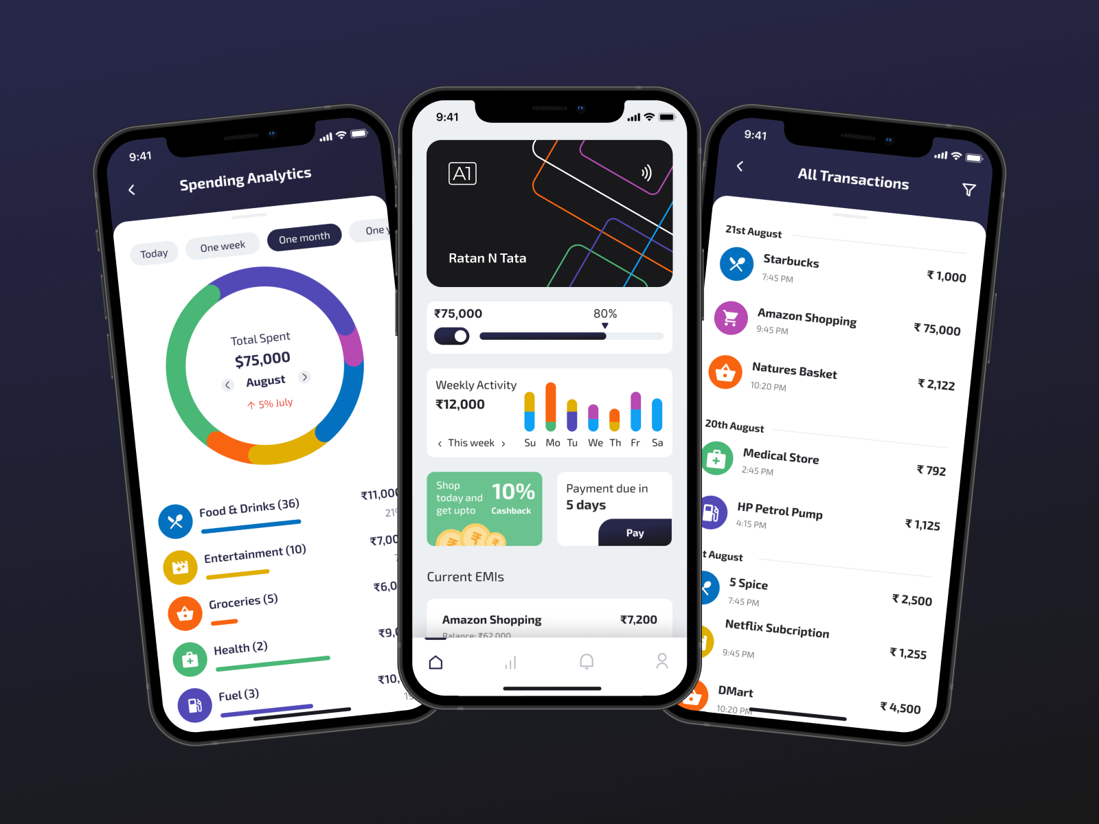
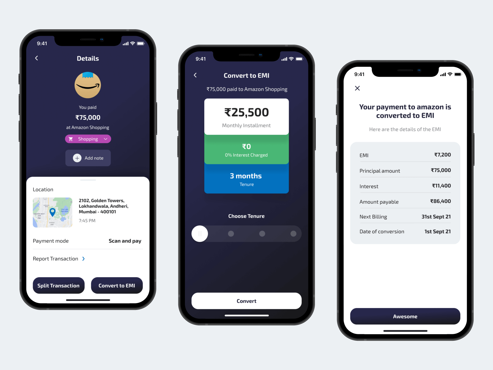
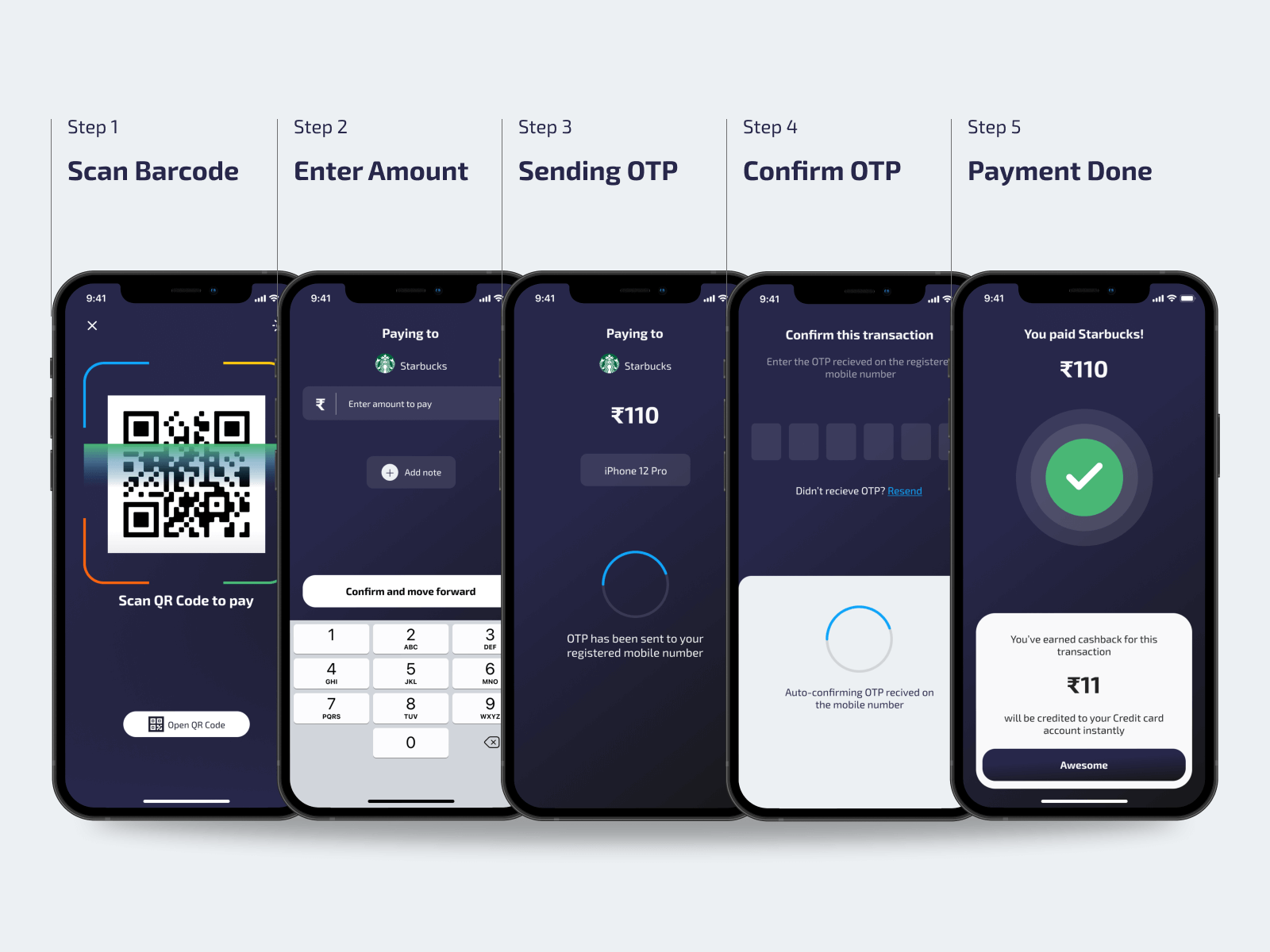
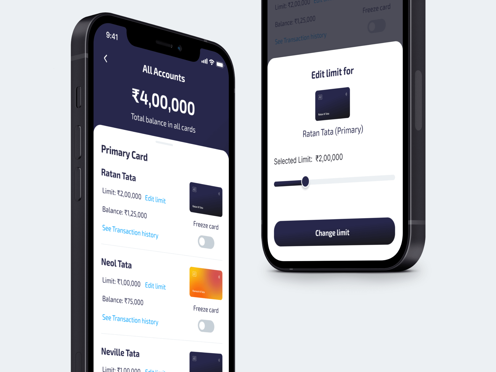
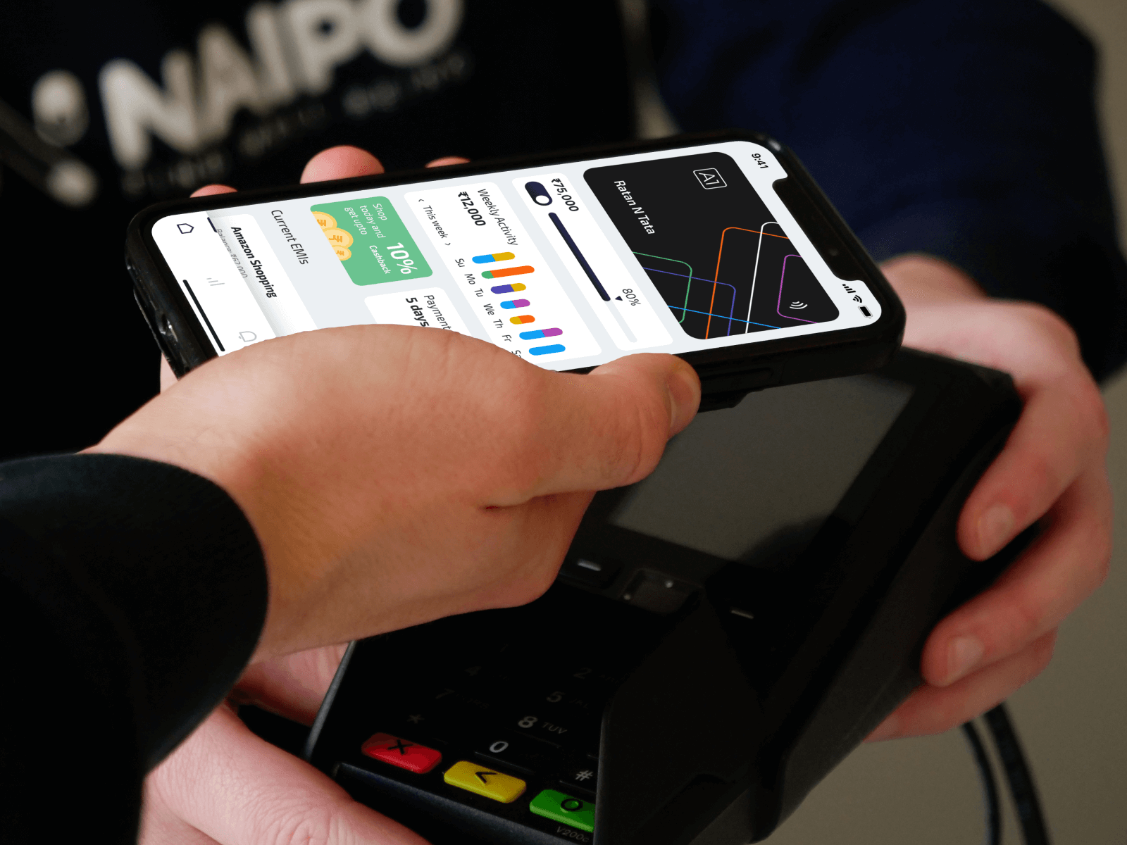
We developed the user flows and presented the flowchart to our client. We added spending analytics to show categories wise expenditure which could be budgeted on a monthly or weekly basis. To make secure transactions we ditched the traditional credit card number and PIN approach and created a new method using a Unique ID and OTP. To encourage people to pay their bills on time we used smart notifications and design tactics. We added 2 different payment methods – scan to pay and tap to pay. The payment flows were made smooth and to avoid faults, we used error prevention methods like OTP confirmation.
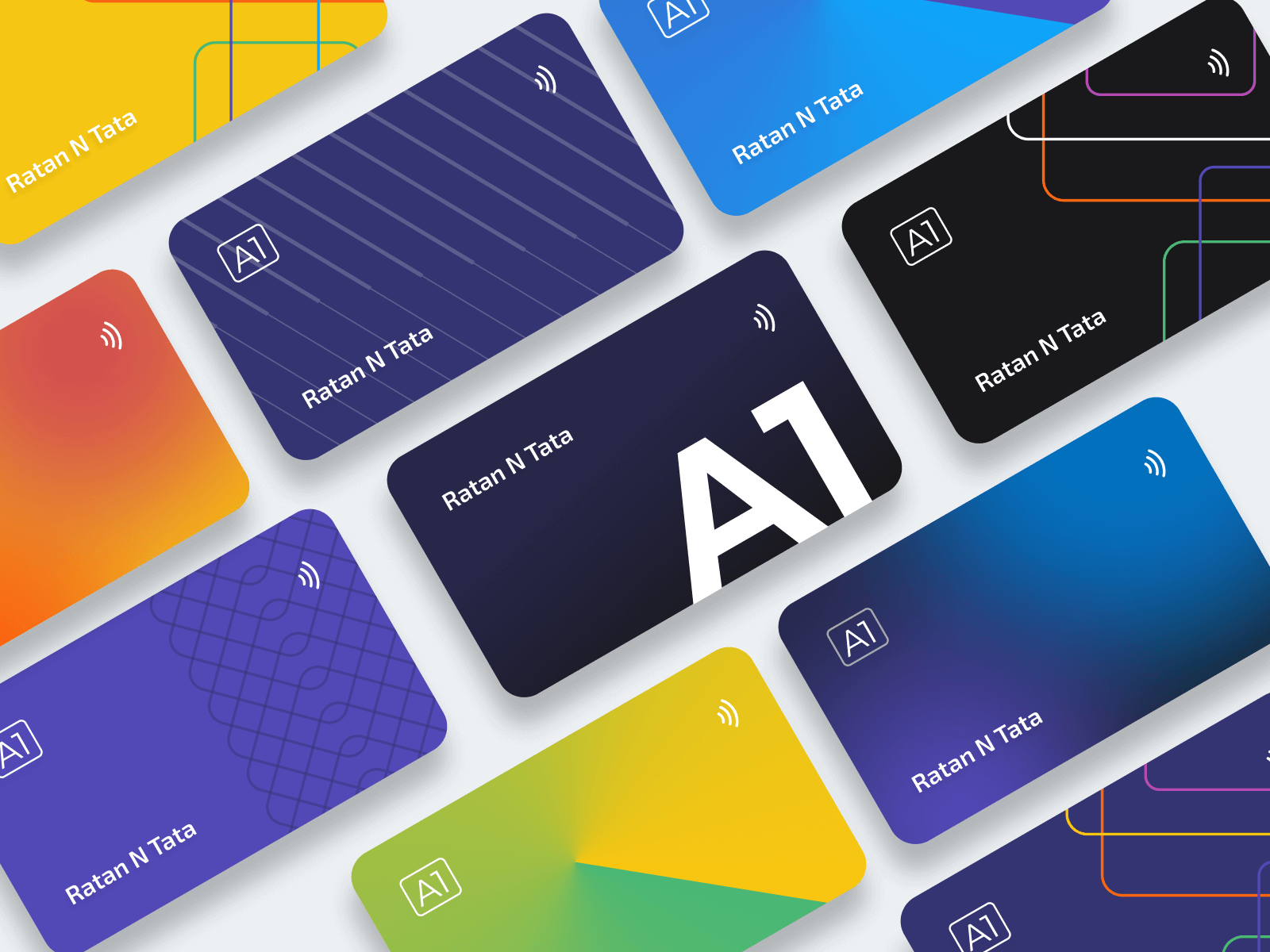
A mood board was shared with the client to understand the design direction he required. The design needed to be very minimalistic and simple for everyone to understand and use the app. We chose blue, black and white to reflect trust, safety and seriousness. And, to ensure a contrasting combination that allows stressing and highlighting text and contents as required.
I choose Yescar to buy my first car. I connected with a guy who was selling his 2018 Innova. I had already seen the inspection report which was quite detailed and described the car exactly how it was.
Bought a Toyota Innova Crysta through Yescar